ColourNext - Sleek Kitchens
ColourNext is an annual colour & decor trend forecast, the only one of its kind in India.
Asian Paints collaborates with experts from different disciplines to put together a comprehensive forecast of colours, materials, textures and finishes for those who design for India.
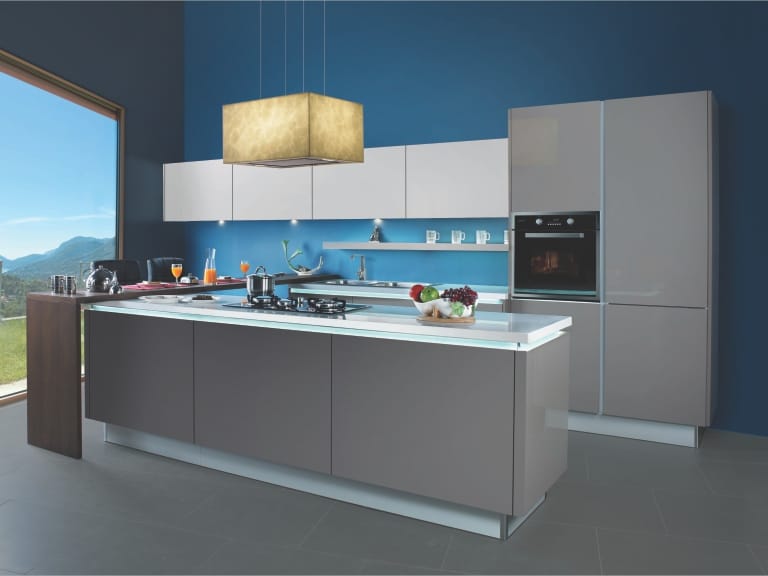
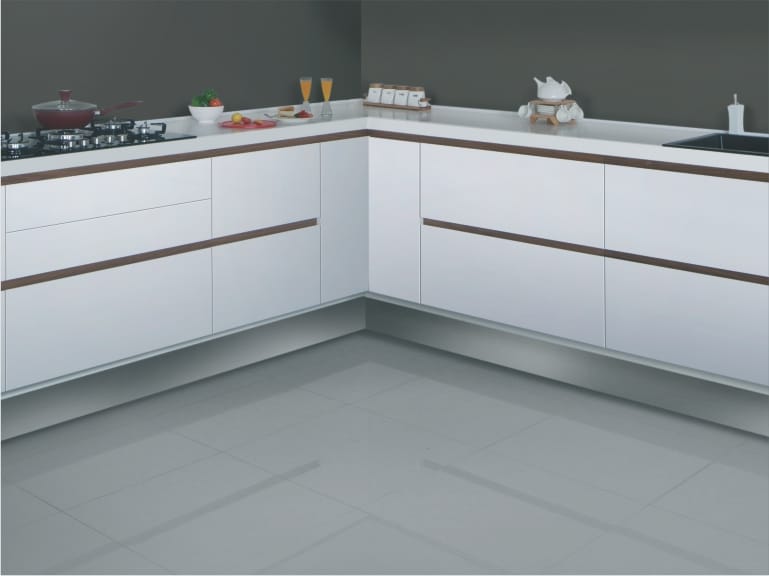
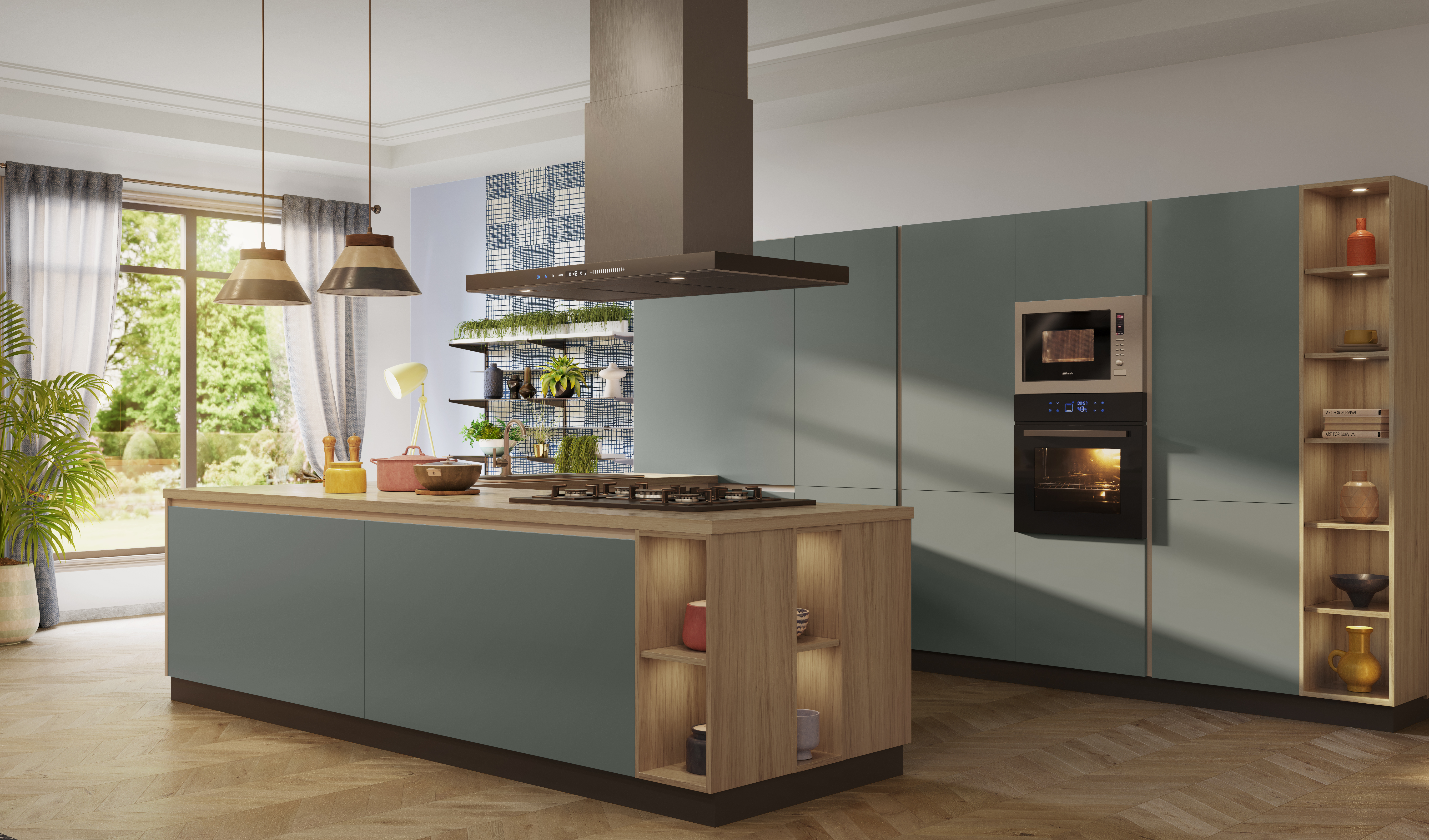
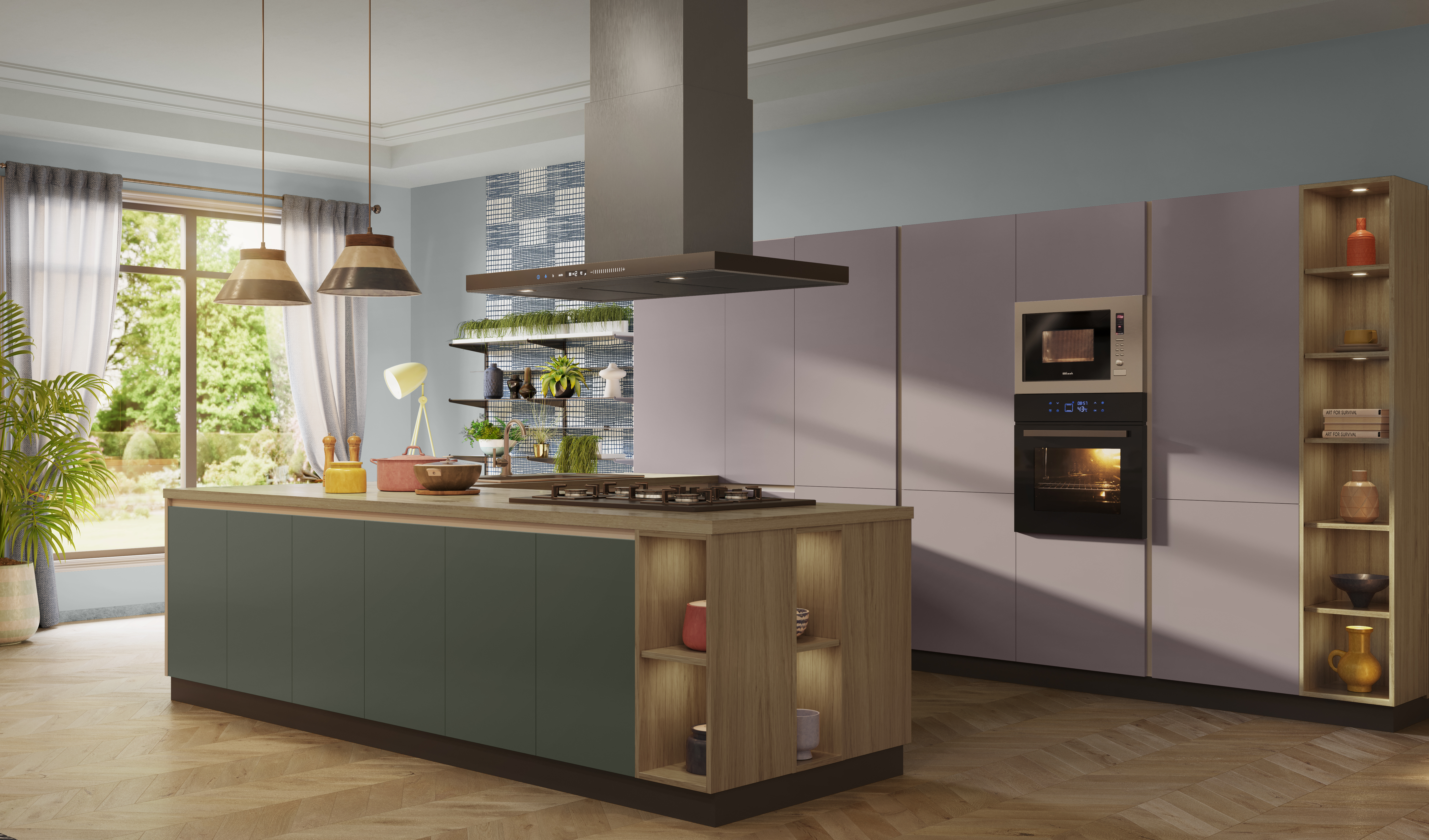
With these latest trends, we help you create your own kitchen ensemble using state-of-the-art kitchen modules and appliances by Sleek Kitchens and enhance it with a range of colours, textures, wallpapers, dining tables, flooring and lighting by Asian Paints.
Cherish
Colour of the year 2021
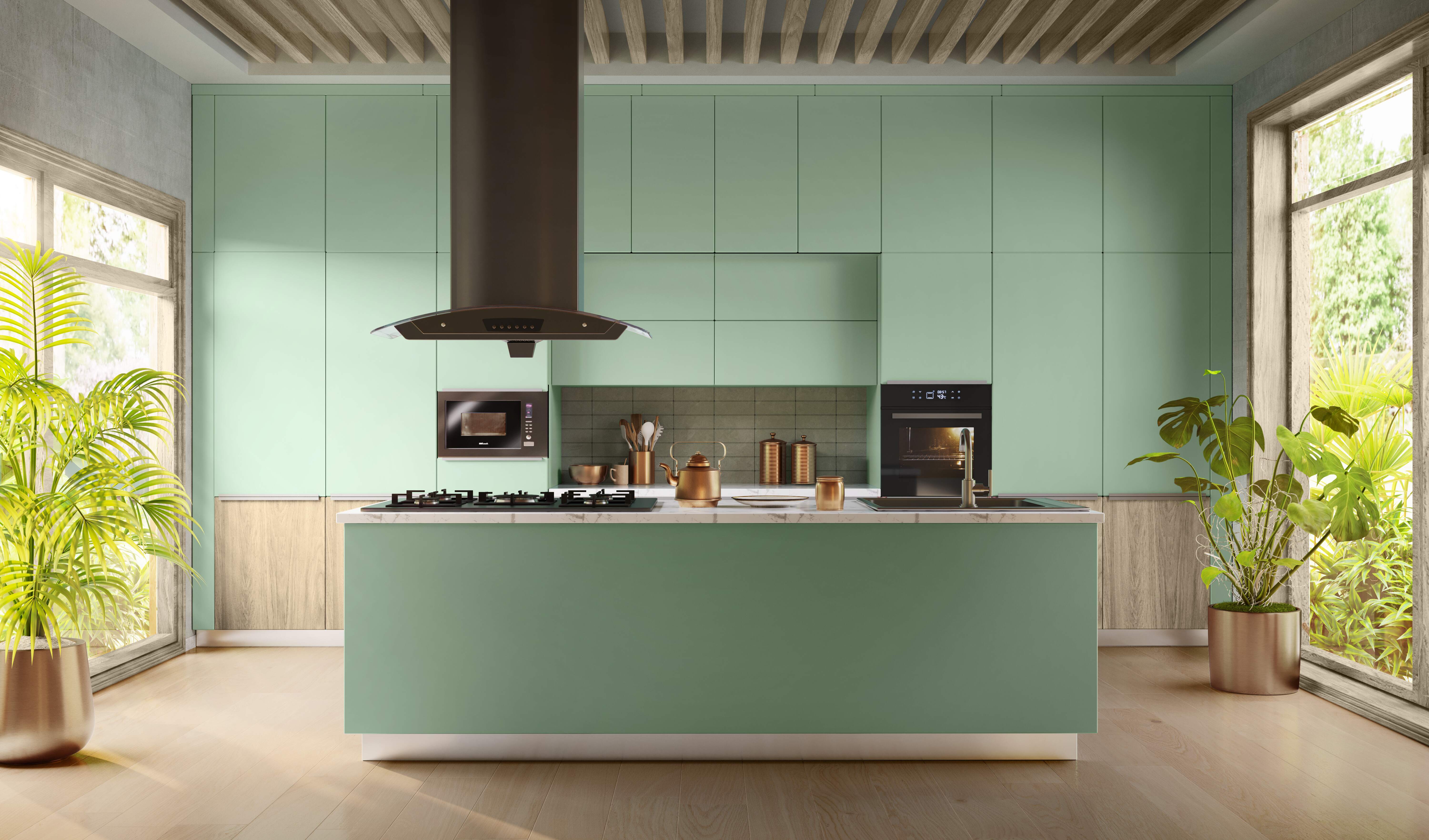
Nurturing, humble and fresh, this colour restores that sense of balance which we dearly seek. A colour that’s neither too warm nor cold, its mint green nudges growth while a hint of blue heals us and revitalises our mood.It brings our restless mind to a place of hope.
Kitchen Inspirations

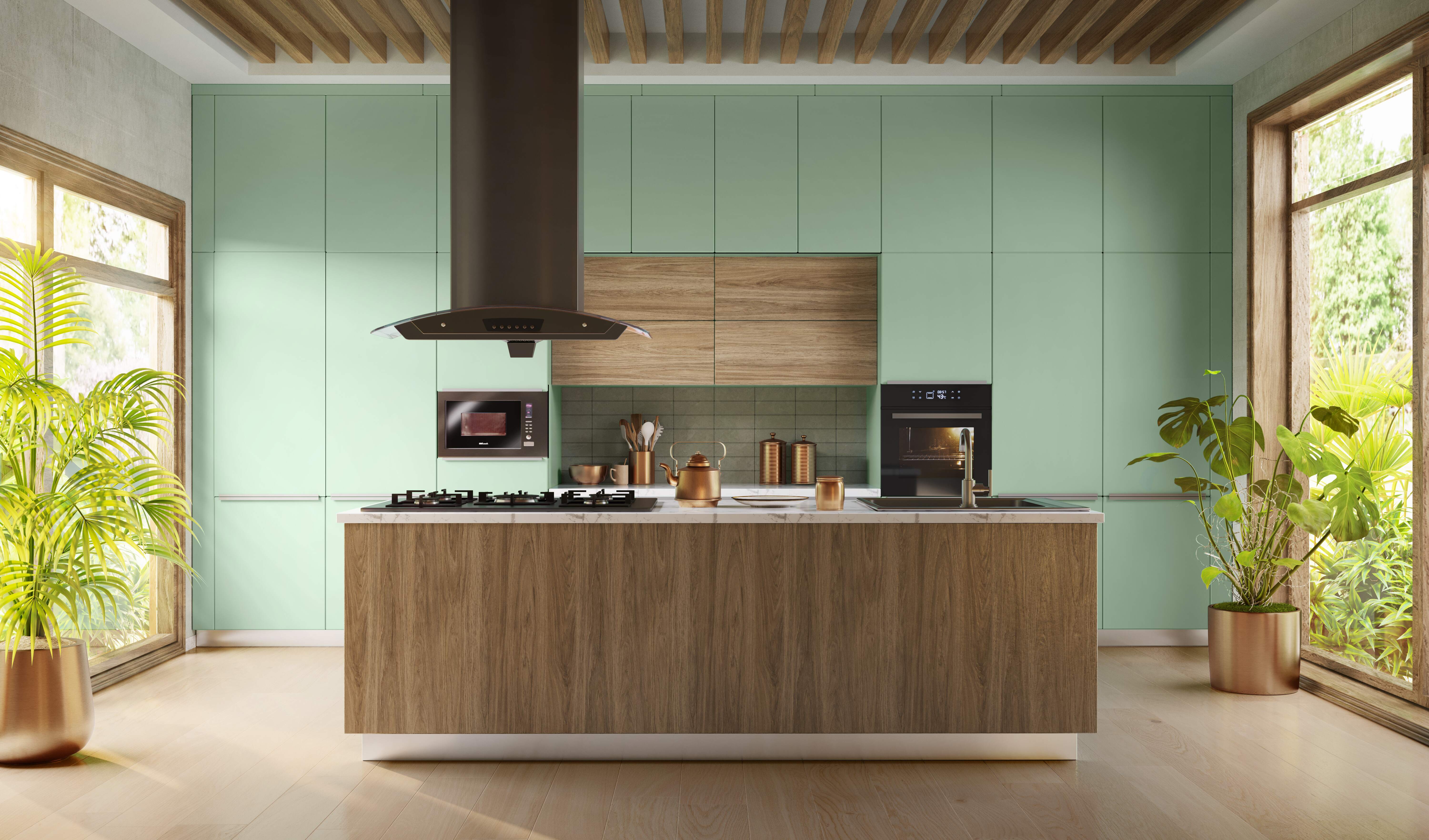

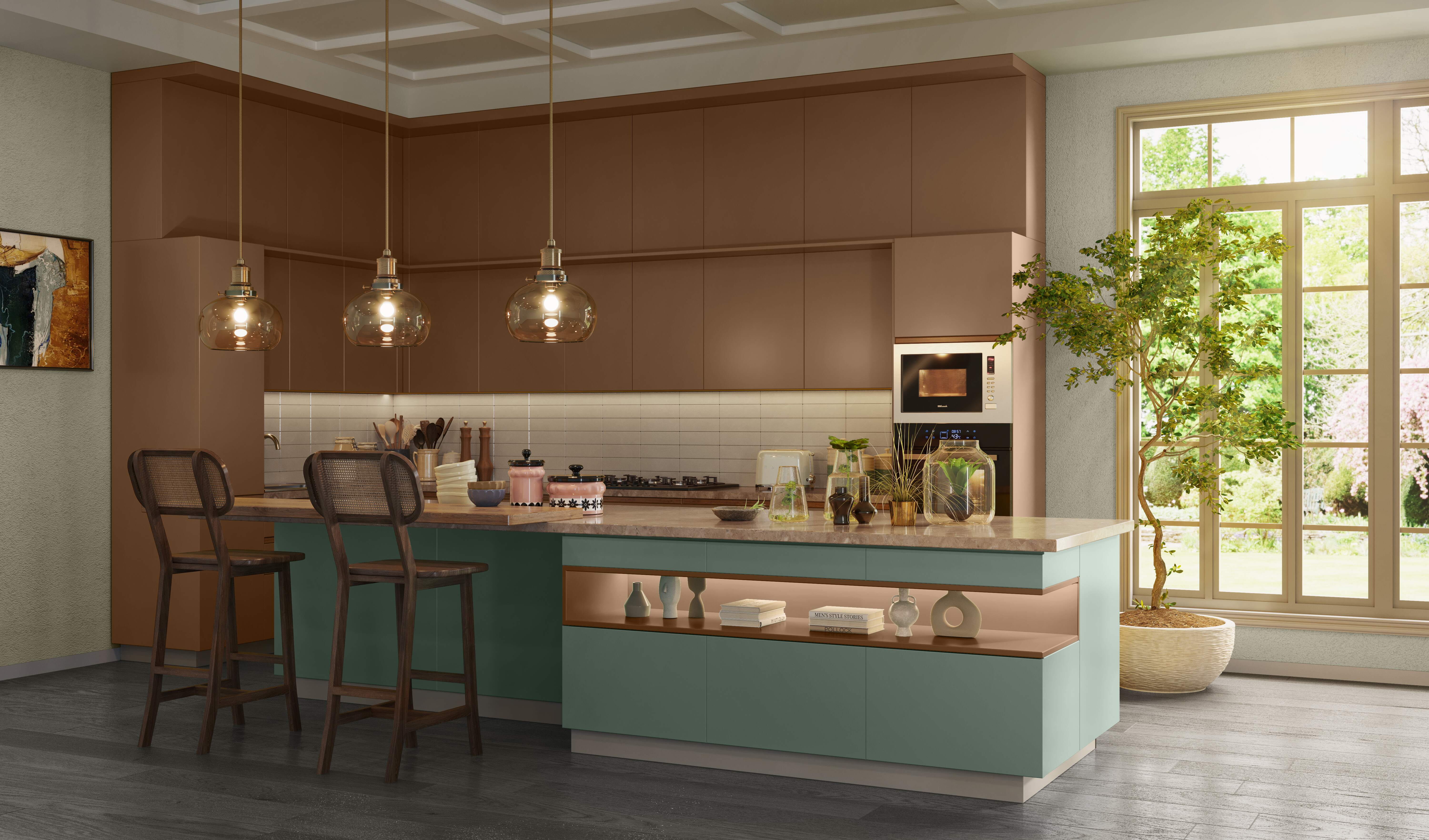
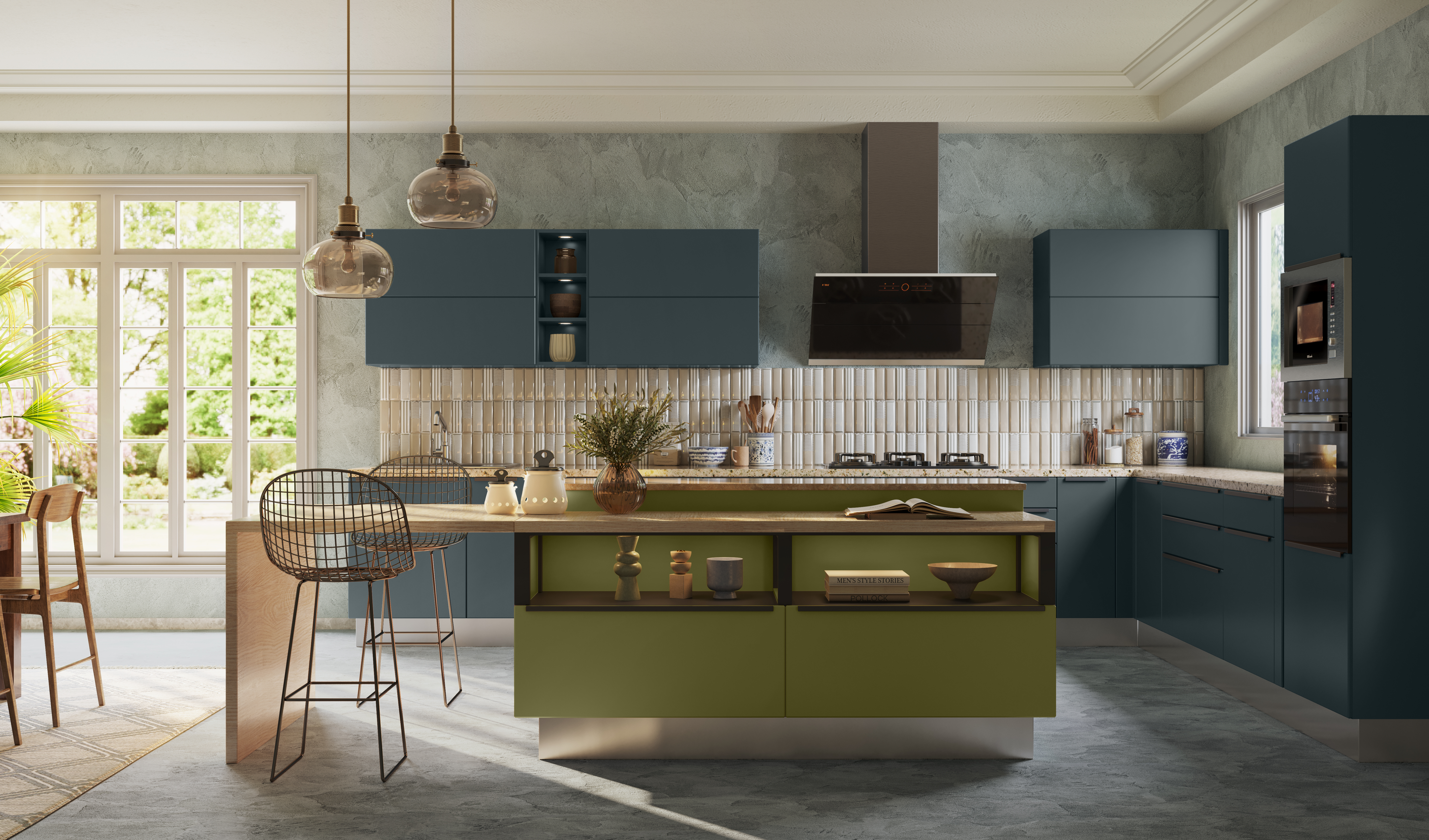
Habitat
Coexistence in an interconnected world
Habitat is a story of coexistence & humility. Humbled by the sudden pause in the past year we begin to see the world as a network of interconnected systems forcing us to change our habits, lifestyle, industry & economy
The Colour Palette
The palette for Habitat stems from a state of humility and seeking a balance with nature. The warm intermediate spectrum represents compassion, while a subtle grey overlay gives it a mature tone. Absorbing shades of brown, olive, murky yellow and dirty blue represent nature and its elements.
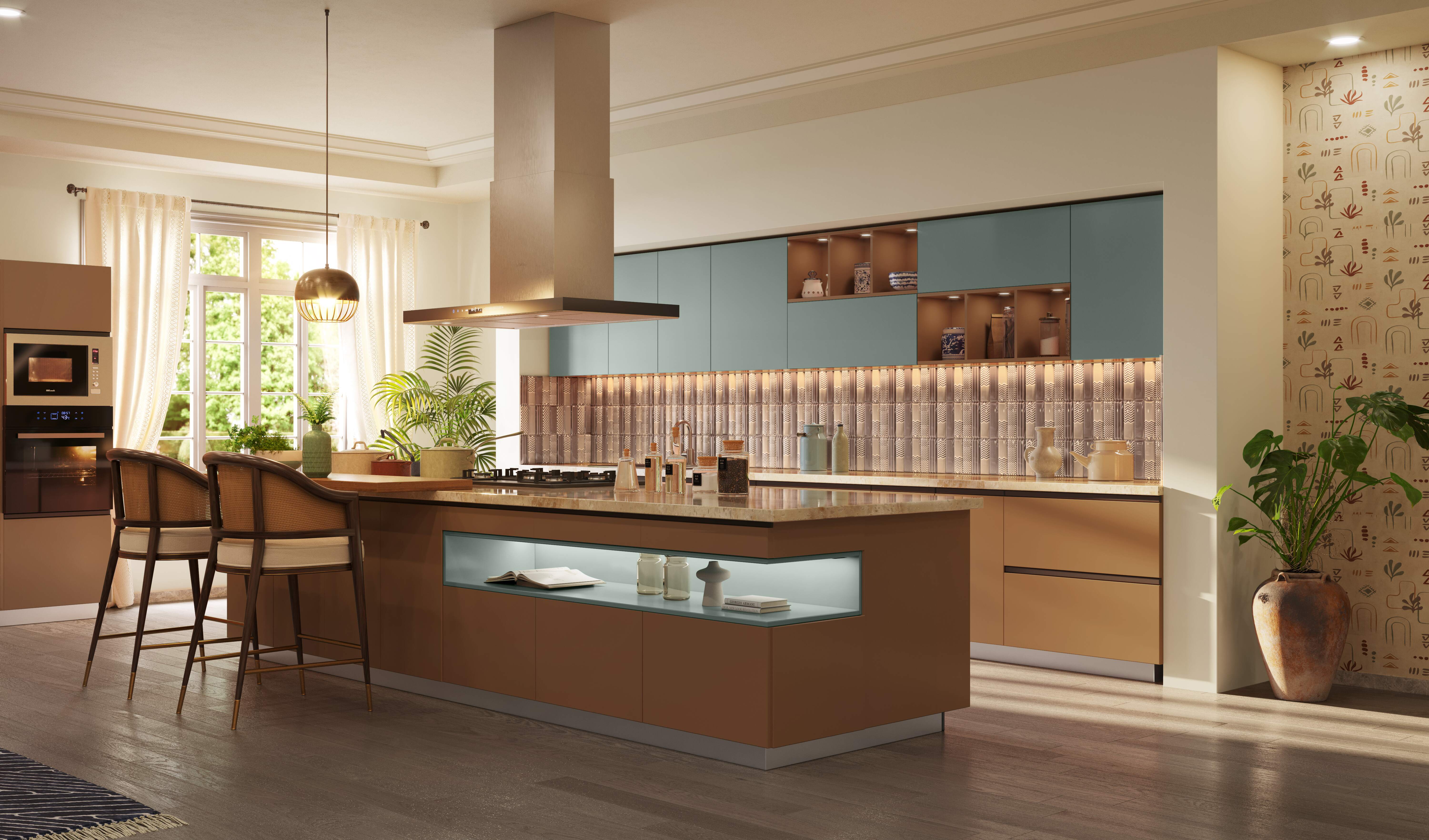

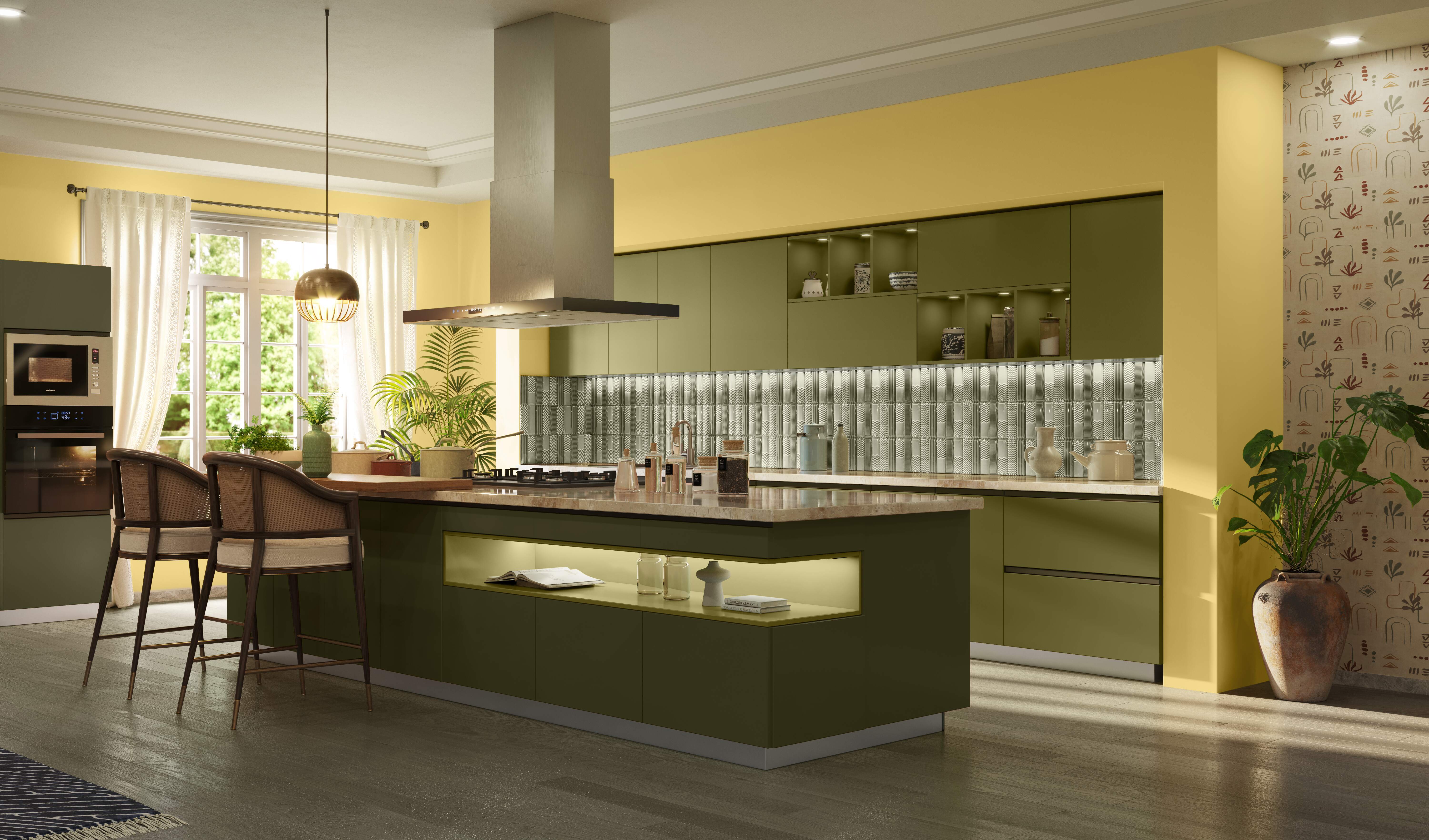



A Home New World
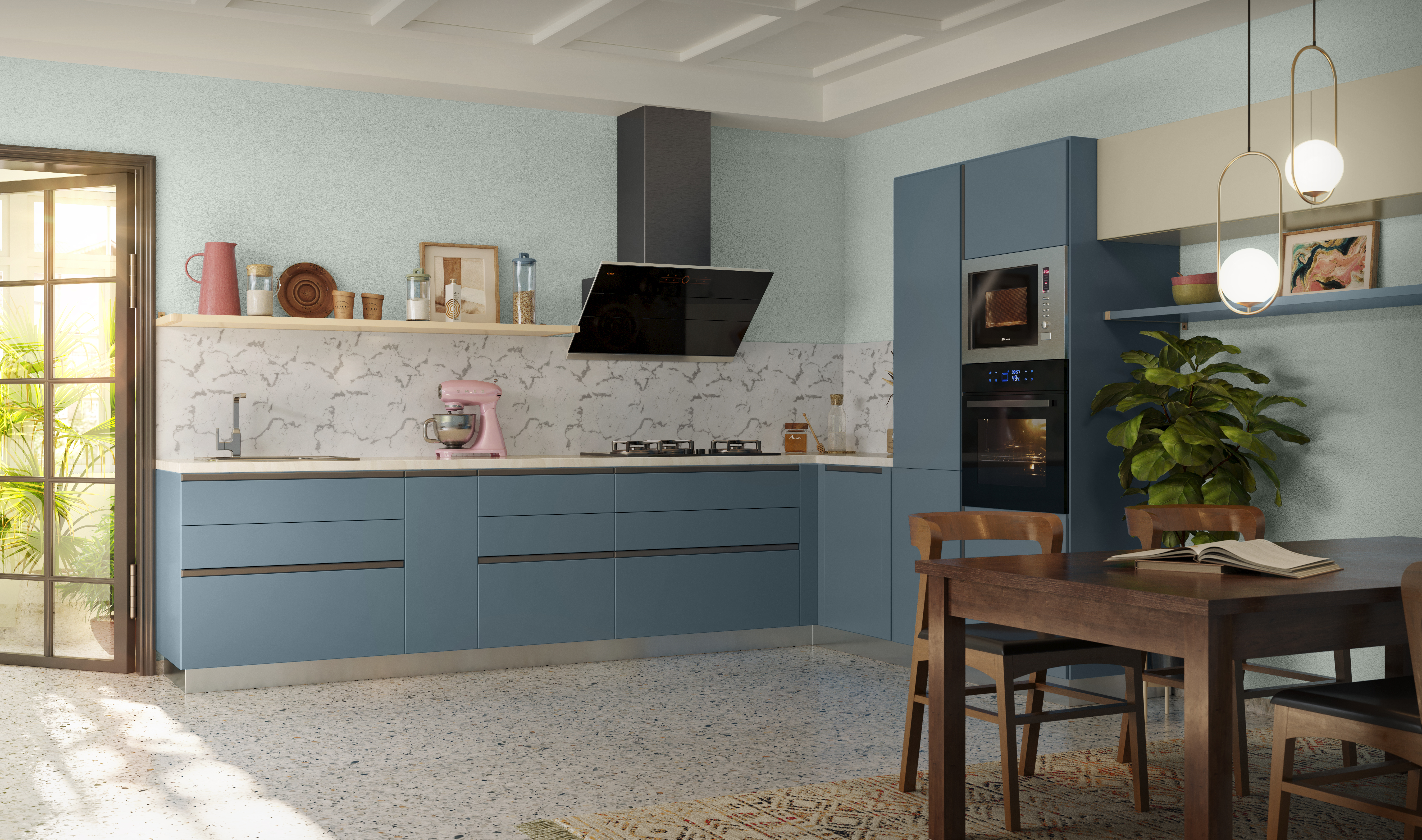
Recalibrating the home ecosystem
How we relate to our home and workspaces has changed. Home is an entire ecosystem where worlds that were otherwise separate, now collide. A Home New World is about this change, about how we hack our spaces to serve new needs.
The Colour Palette
To counter the frenzy of everyday WFH life, the cool colour palette of A Home New World uplifts your space and your mood. Pops of energetic colours inspire you in small doses, giving you a break from the routine. Versatile neutrals give you positive respite while making sure you’re still getting things done.




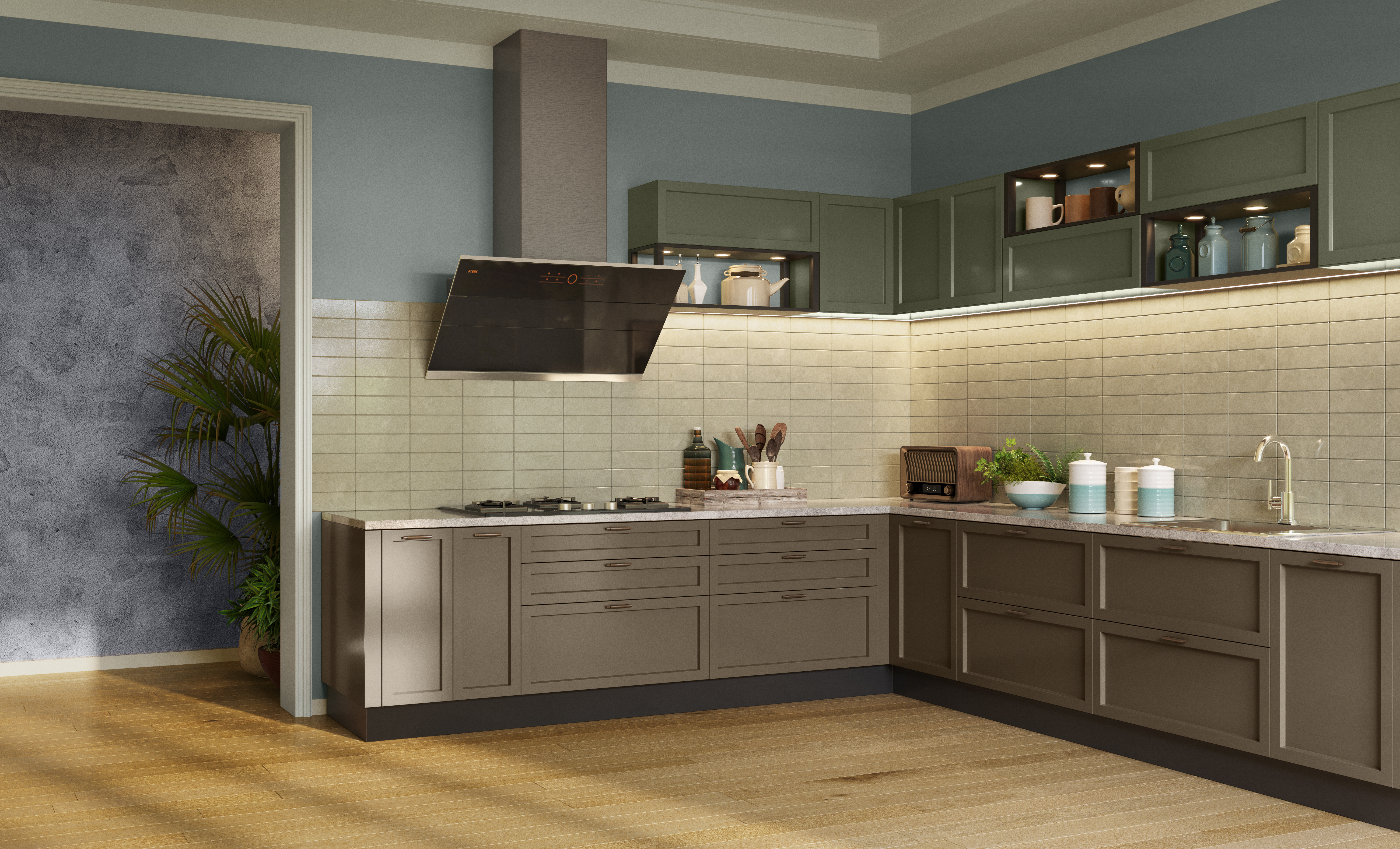
Felicity
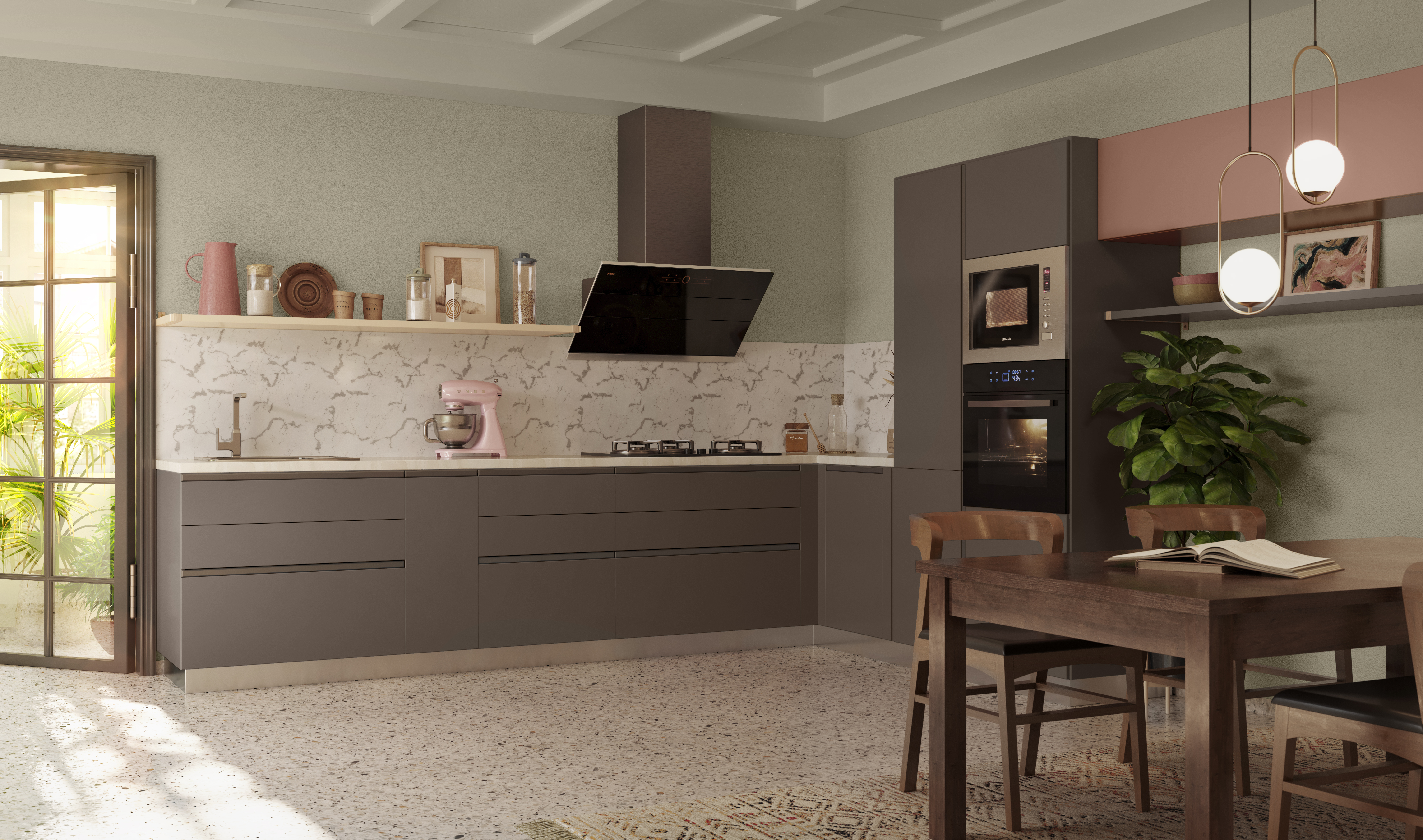
Adding value, eliminating frills
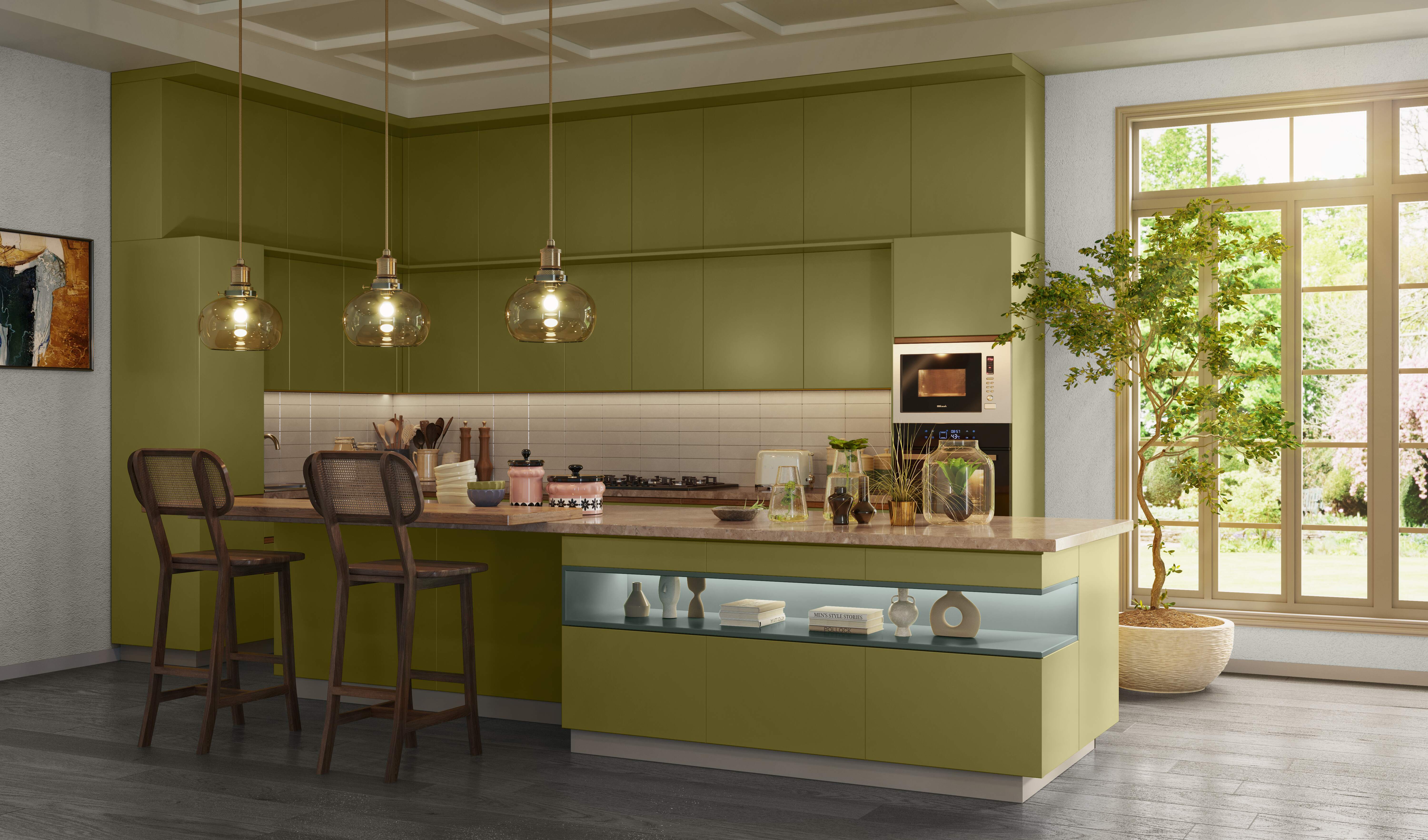
Felicity is a conscious choice to favour real value over flaunt value. Indulgence takes a backseat as we choose things that serve a purpose, are beautiful and provide us a lasting sense of comfort.
The Colour Palette
The palette of Felicity is timelessly charming – colours that have endured over a long period of time, yet unwaveringly appeal to us. Classic colours like dark green and brown that are intense are balanced by pale dye-like natural colours. Muted grey-blue, soft pinkish beige and sage green are inspired by mid-century graphics. Neutral and calm, white holds the palette together.



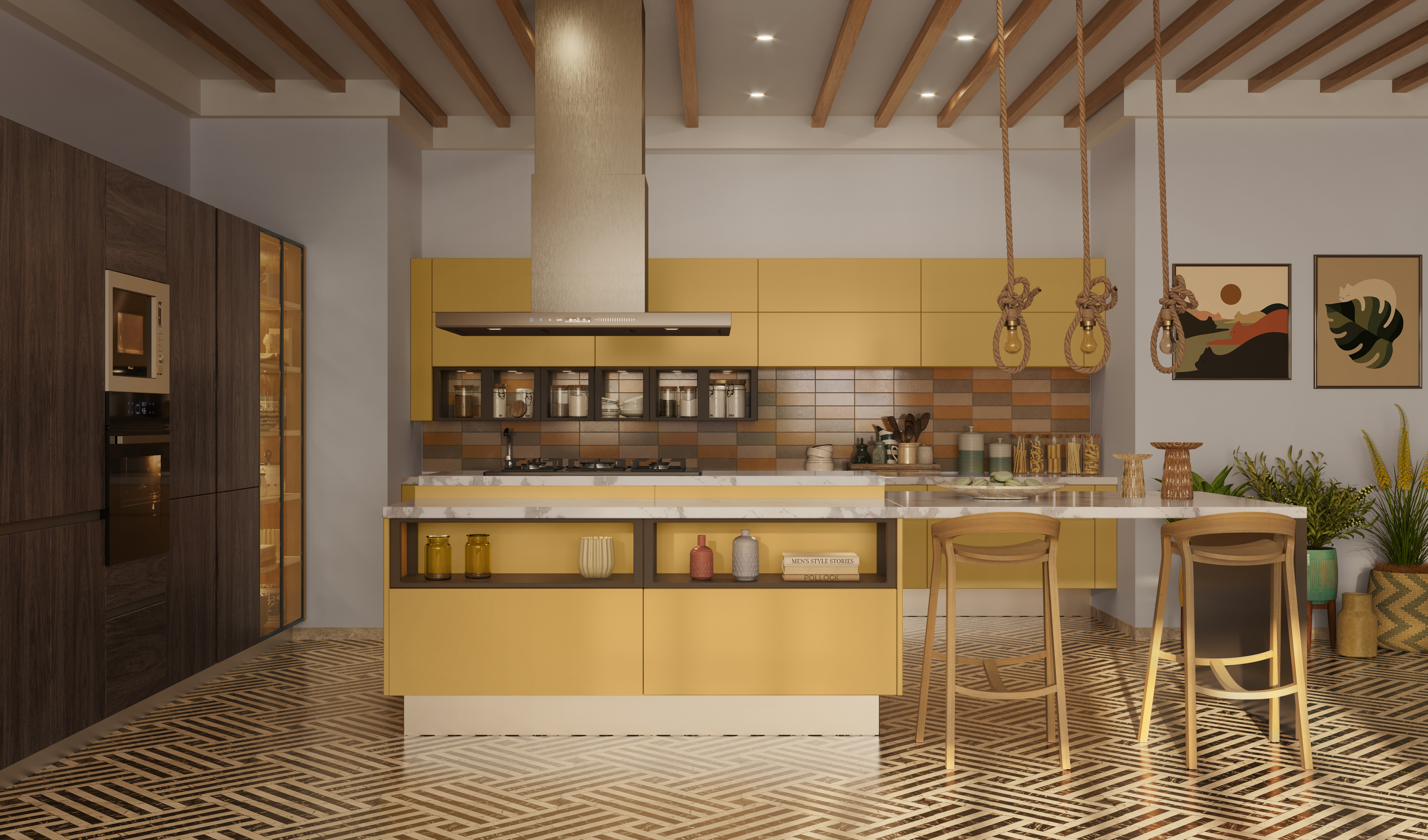
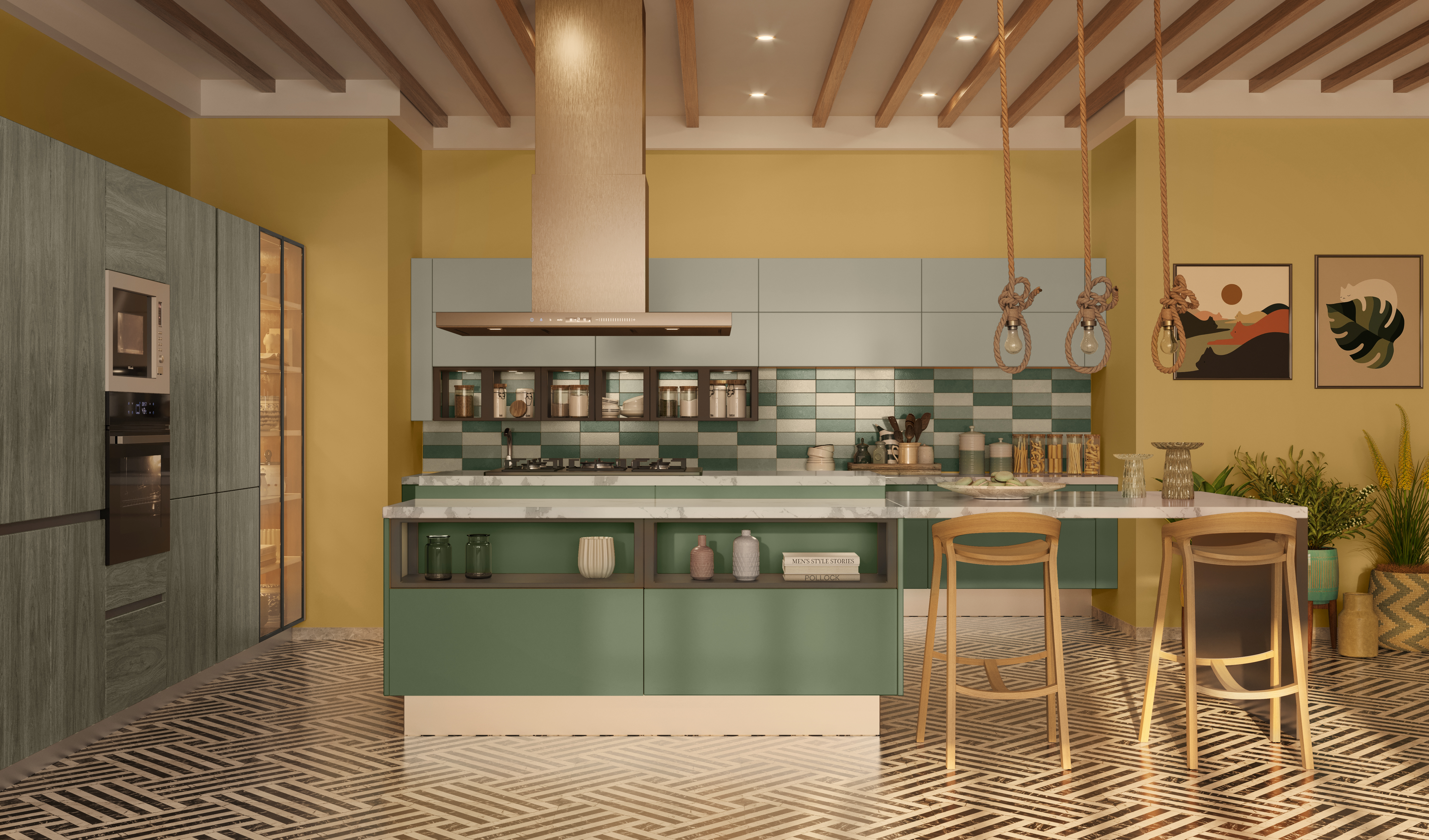
Z Futures
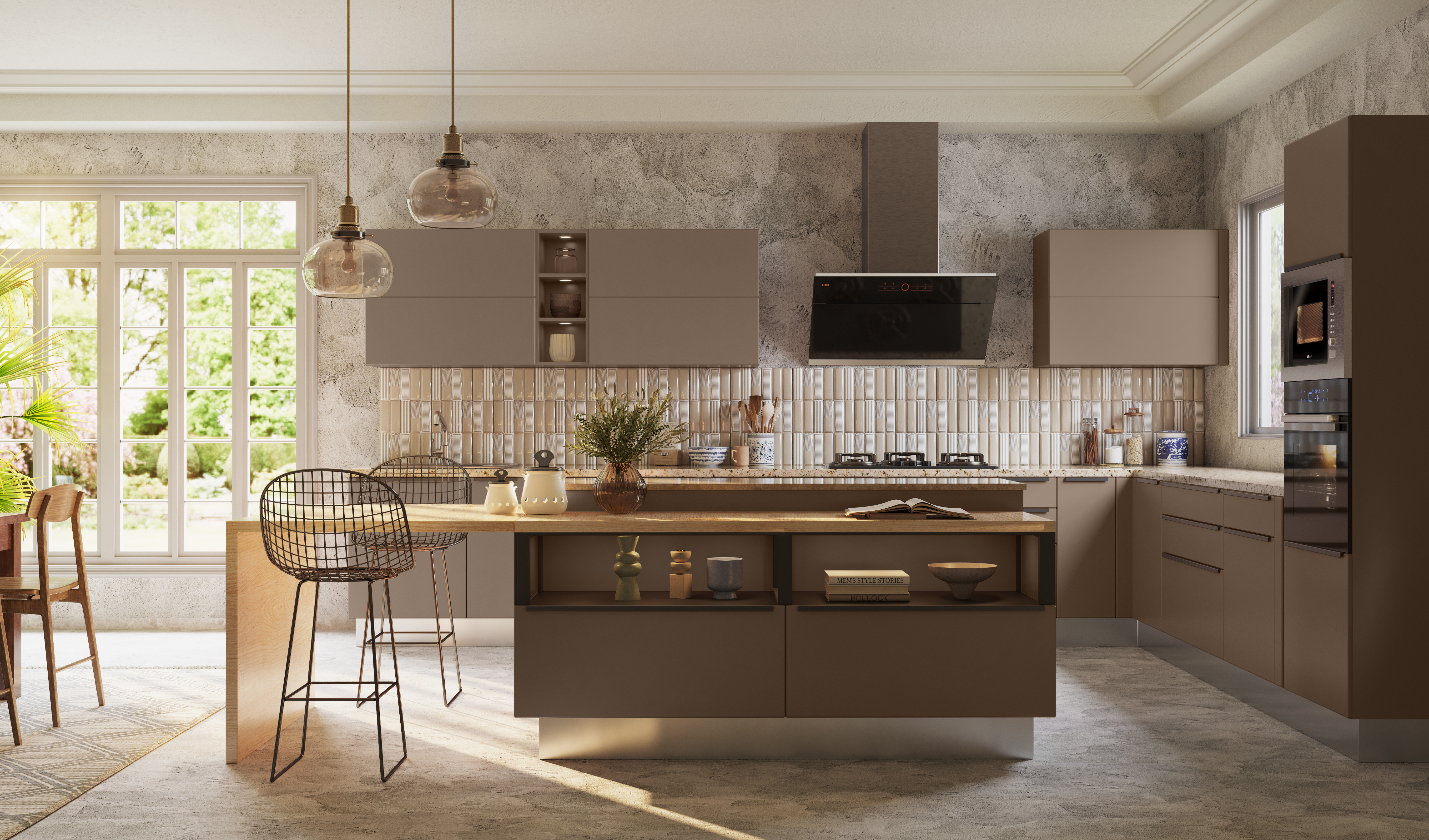
Coming of age of Gen Z
Z Futures is inspired by this self-assured, liberal and fluid attitude of Gen Z – a youthful spirit of adventure mixed with domestic cosy. Fluid spaces, community stories, products designed for good and objects that display pride in one’s roots.
The Colour Palette
Unusual contrasts express the inclusive and tolerant nature of Gen Z. Light and airy shades when juxtaposed with dominant orange, bottle green and a dark greyish green bring out the idea of “assembled oddities”, a quintessential Gen Z quality.







 The ColourNext Sleek Kitchens Inspiration Catalogue


